Data storytelling: The most important things to keep in mind
Introduction
Data storytelling is one of the most critical skills for FP&A. It brings data to life, transforming it into accessible, effective visualizations and building narratives that explain it so that decisions can be influenced and strategic action can be inspired.
Data story levers
FP&A can leverage data stories through the following three steps:

- Explore: Understand the relationships that exist between variables, identify outliers and patterns, analyse business problems and business opportunities.
- Explain: Structure the data in an effective visual format and add context to make it meaningful and actionable for decision-makers.
- Inspire: Tell an impactful story that inspires actions.
How to build an impactful data story?
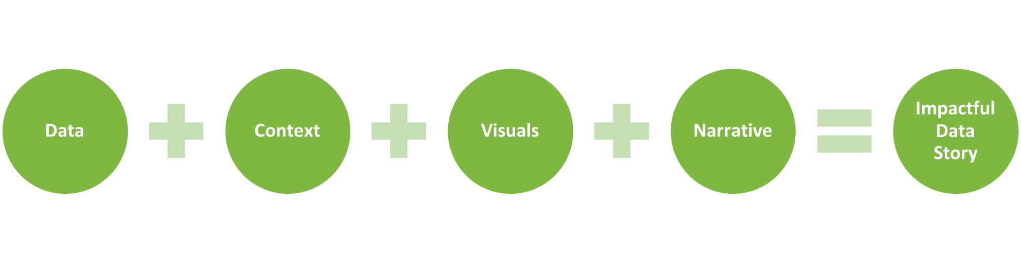
Integrate data, context, visuals, and narrative. Data alone makes presentations boring and not engaging. Add context to make data meaningful. Create data visualizations in order to help the audience understand the numbers. Use clear and simple visuals that everyone is familiar with instead of using complex and fancy charts. Data should also have a narrative around it to explain the meaning behind the numbers, engage the audience and make the message both sticky and memorable.
Add context. Data is meaningless without context. To make an impact on stakeholders, FP&A need to add context to their story through comparative numbers, for example, through benchmarks, competitor analysis, prior period figures and trends. To add powerful and effective context to data stories, FP&A need to find the answers to several questions:
- Who is your audience?
- What do you want them to know or to do?
- What bias does the audience have?
- What questions do you expect from them?
- What message do you want to deliver?
- How will you communicate to your audience?
By answering these questions, FP&A will be able to add the proper context with an appropriately tailored tone, language, and level of detail.
Use effective visuals. Humans process visuals 60,000 times faster than text. People can retain visual information at a rate more than 3 times higher than the rate they can retain text alone. Our brains see words as pictures, not individual letters. As a trusted business advisor, FP&A need to turn data (numbers and words) into visual elements such as charts, graphs, and maps. This would substantially improve the quality of communication between FP&A and stakeholders. There are six types of visuals that can foster this communication.
- Text: When you have one or two key numbers to share, simple text can be the best way to communicate. Make the value big enough to catch attention and stand out, and then add supporting context to clearly make your point.

- Tables: When you have multiple different units of measure, simple tables are a great tool. Arrange your items to start with the most important ones and use light table borders or simply white space to keep the attention on the data.

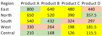
- Heatmap: You can use a heatmap when you want to leverage colored cells to convey the relative magnitude of the illustrated numbers.
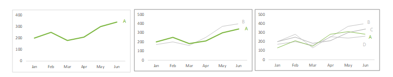
- Line graph: When you have to show a single series, two series, or multiple series of data, a line graph is a great option. Avoid comparing more than 5 lines in a chart. Ensure the color of the focused line is different to the others.
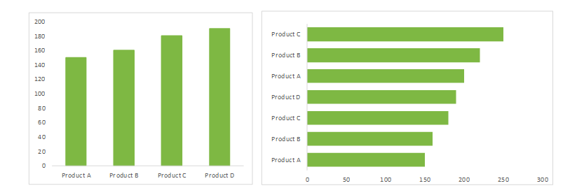
- Bars: When you need to quickly show which category is the biggest, which one is smallest, and the incremental differences in between, a bar chart is a great option. Use horizontal bar charts when the category names are long.
- Map: This shows data spatially to help illustrate concepts such as trends across geographic regions or a specific location’s impact on the relevant outcome.
Deliver a memorable story. To make the story both sticky and memorable, FP&A should ensure the following:
- Focus on one story and one big idea.
- Speak the language of the audience and avoid technical terminologies.
- Explain the data with context and the story behind it.
- Give the audience reason to care about the story by starting with an attention-grabbing headline.
- Support your data with evidence and credible resources.
- End your story with a call to action and let people know what you want them to do.
Conclusion
Technology has given us a greater amount of data along with more sophisticated visualization tools, yet data cannot speak for itself. FP&A has to learn the best practices in data visualization and master the art of storytelling by understanding how to use the combination of data, visuals, and narrative that are available today. This will enable FP&A professionals to build impactful data stories, influence decision-makers, and lead clear change as trusted business advisors.
Ready to learn more?
To discover more about how Unit4 can help your organization use FP&A to allow effective, compelling data storytelling, check out our dedicated product pages here or click here to book a live demo.